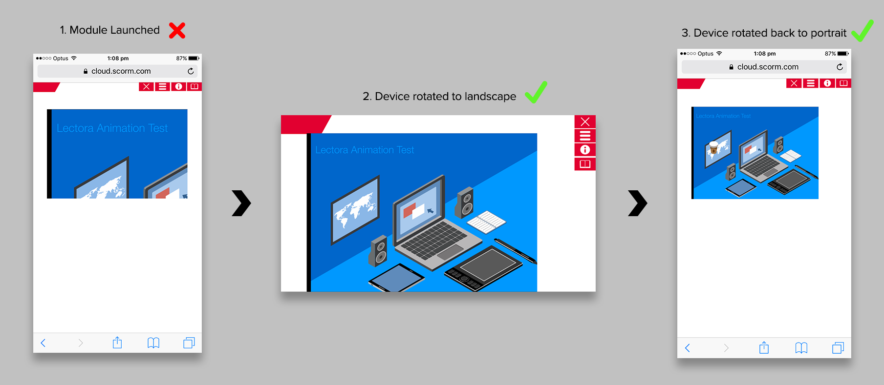
Web Window Cropped When Responsive Page Loaded in Smartphone Portrait View
Hi Folks,
I'm having some problems with web window content (animations from Adobe Animate) failing to resize correctly when a page is loaded in smartphone portrait view:
- Page loads in smartphone portrait view - web window content is cropped
- Device rotated to landscape - web window appears correctly
- Device rotated back to portrait - web window appears correctly
[See attached screenshot]
undefined
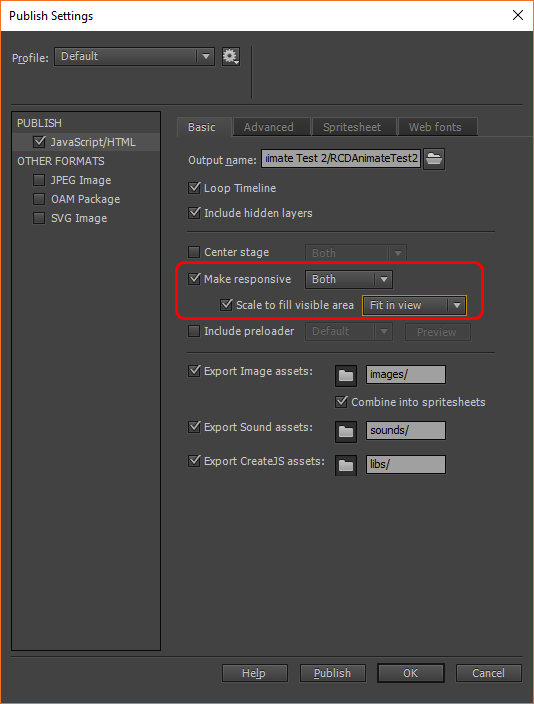
Adobe Animate's publish settings are set to enable responsive width/height and to scale the content to fit the web window, however this doesn't appear to work when a page loads in smartphone portrait view.
This happens on Firefox PC as well as my iPhone.
Has anyone come up against this before, or have any clues? Wondering if there's a way I can trick it by manually forcing the web window size or similar?
Cheers,
Cam