Setting margin size on text blocks in responsive design course
January 20, 2016 12:00 AM
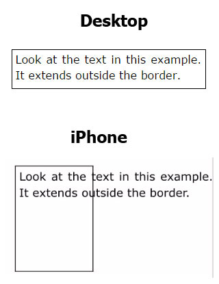
This is an odd one that took me awhile to figure out what was causing it. I set a margin size and added a border (which I do when I use a text block as a label), then changed the shape of the text block in the mobile phone view. After publishing to HTML it will display the border correctly, but the text will be in the original shape, coming out of the text box. I like having a margin because otherwise the border is too close to easily read the text within it. I attached a photo of the combined screenshots to show what I mean.
Discussion (10)
You don't even need the border. It just happens that I only use margin size with borders.
Can you give me some additional information so I can understand your experience? What version of Lectora are you running 16 or 16.0.1? When your viewing the course what browser are you using? Have you tested multiple browsers? What type of iPhone do you have and which IOS are you running? Thanks for your help!
I'm using Lectora 16.0.1. I've tried in both Safari and Chrome, on an iPhone 5s, an Adroid phone and an iPad. It displays incorrectly on all mobile views, no matter how I size the text block. It is basically showing the text in the shape I give it for desktop view, but showing the border in the shape I give it for mobile viewing, both for phone and tablet, horizontal and vertical. I even tried expanding the text block in desktop view to be a single line. Then when I published it, it showed the text as a single line on mobile devices, but the border in the shape I specified for mobile viewing. The only way to keep this from happening is to set the margin to zero. But this makes it hard to read.
undefined
It looks like you might need to add some room around your text box. With responsive it's best to let your text boxes have the ability to expand and adjust as necessary. Have you tried expanding the text box?
I tried viewing it in "Run" mode and the same issue occurs. All I have to do is add a margin size to any text block and it will display incorrectly in run mode when looking at the mobile view. Basically it'll show the text block in the desktop shape.
I'll bring it to the developers attention. Are you able to share a course file with the issue?
Feel free to send it over if you have time. Otherwise they should have enough information to get started.
I could make a simple one. I think I shared on google drive last time as I can't send zip files through email.
I shared a file called Margins.zip with you on Google Drive.
Thank you! I got it in my email and I'll be sure to pass it along.
Discussions have been disabled for this post