Lectora bloating courses with dozens of needless button images
September 15, 2020 12:00 AM
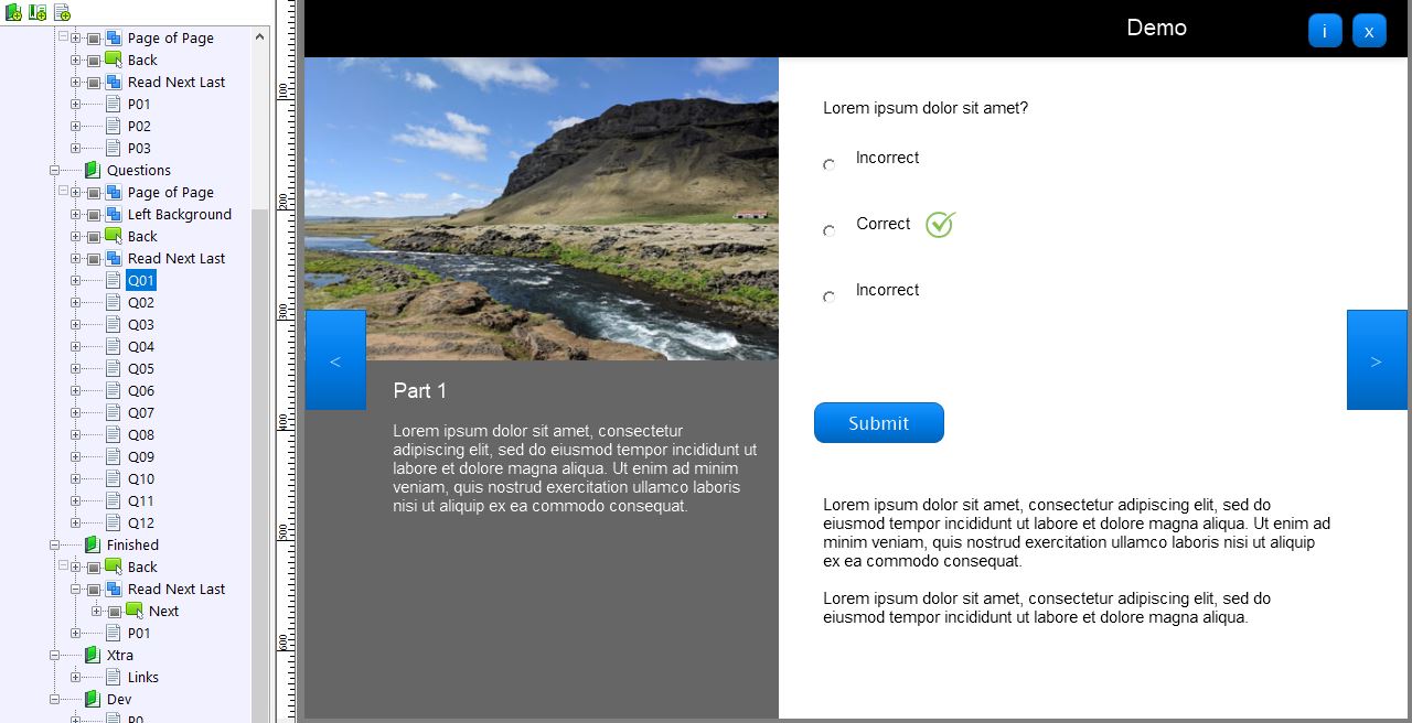
One of the biggest surprises as I moved to later versions of Lectora (18-19) is how Publishing needlessly duplicates button images to the point where hundreds of unnecessary images bloat the images folder. I've prepped a demo with 10 images in the 'images' folder. By simply copy/pasting a question page (that has a Back and Next navigation buttons and a Submit button) to have 12 question pages, then Publishing the course (in this case SCORM), we now have a published 'images' folder with 108 images in it — the same images... even if the source images were scaled, there would be no need for duplicates.
The most shocking thing is that it generated images for these buttons in the first place. NONE are actually needed. There is nothing about the Lectora button generator (which these buttons were created with) that necessitates a graphic, and ironically this is knowable by Trivantis/eLearningBrothers as this is https://community.trivantis.com/forums/topic/lectora-18-creating-extra-images-for-each-styled-image/), but now the issue seems everywhere, like eventually they'll just want a Publish to spit out a series of bitmap full image pages.
This seems to be the web development equivalence of centering your Word document title by putting your cursor in front of the title and smacking the 'space' key a dozen times until it looks centered.
Making buttons images by styling elements appropriately would also resolve other issues with rendering such as the "Blurry Button issue" as noticed when various web browsers are not set to 100% zoom (see https://community.trivantis.com/forums/topic/text-button-font-is-blurry/).
And if you do decide to update the Lectora button feature, just an FYI, the pharmaceutical-pill style gradient button hasn't been in vogue in about 15 years. ;)
-Darrell


Discussion (2)
Joe (@wheels), your reply made me actually laugh out loud! Legitimately.
We're transitioning from 18-19 so haven't had a chance to notice the blur fix - awesome. I'm trying to get the powers-at-be to keep us using the latest version, so hopefully we'll benefit from frequent updates soon. Some day's I feel they'd be happier in the era of semi-annual service packs! Hopefully they'll figure out frequent updates are commonplace and it's best to stay latest and greatest. I know that for thing like accessibility there are many updates that are must haves and not just nice to have, hopefully eLearning Brothers can keep them coming ASAP.
My old school web developer brain can't stop trying to reduce images and redundant code/markup a remnant of someone old enough to build for dial-up — now given affirmation of my minimalist OCD by those managing our LMS server load ;)
Thanks for the quick reply!
Hi Darrell (@Web-Foley)
The blurry button text issue was fixed in v19 we are sorry for the inconvenience.
The multiple image files is remnants of supporting IE 8 which we supported up until late last year. We will work on removing the code that generates those extra files that were necessary for supporting Amelia Earhart's web browser. Thank you for the feedback, you are right. I like your MS Word analogy it made me laugh and cry at the same time.
Pill doesn't seem to allow removing the gradient, making it forever stuck in the Green Day heydays. We'll take a look at that too! It certainly shouldn't have a gradient by default.
eLearning Brothers is committed to advancing and enhancing Lectora. Please keep the feedback coming, we are listening.
- Joe
Discussions have been disabled for this post
