Design Tips: Hamburger Icon
November 9, 2015 12:00 AM
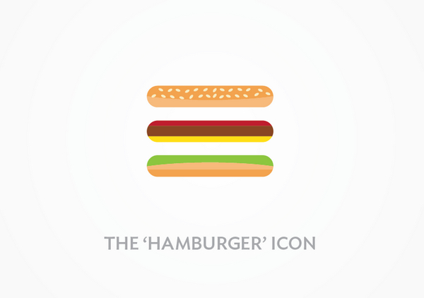
Now that Lectora RCD is out, people will start actively designing courses for small screens. The three-line hamburger icon is a well known symbol for opening a menu on mobile websites and apps. But is it? I've read a number of opinions in the past year and many people think that the icon is confusing. I think today everyone knows that "floppy disk" is for "saving" but many people not only don't associate the three-line icon with "see the menu", they don't even recognize it as a clickable object.
Even BBC picked up on the subject: 'Hamburger icon: How these three lines mystify most people'
I've compiled a few useful links if you'd like to form your own opinion:
A/B testing and links to research:
http://exisweb.net/mobile-menu-abtest
http://conversionxl.com/testing-hamburger-icon-revenue/
Designer articles:
http://www.designyourway.net/blog/inspiration/the-hamburger-icon-and-the-controversy-around-it/
http://www.persuadebydesign.com/hamburger-menus-good-usability/
https://lmjabreu.com/post/why-and-how-to-avoid-hamburger-menus/
http://www.webdesignerdepot.com/2014/06/how-to-solve-the-hamburger-icon-problem/
Designer discussion:
https://www.designernews.co/stories/14632-do-people-understand-the-hamburger-icon-used-for-mobile-navigation-menus
Discussion (1)
I've never looked at it as a hamburger! I always thought it was supposed to look like three lines in a list or something. How interesting :)
Discussions have been disabled for this post