my mobil version dont work
June 1, 2017 12:00 AM
Hey, maybe someone can help me :-)
i made a little eleaning modul for smarthone size. For this i took the size preset 320 x 416 and built a scorm file for our LMS.
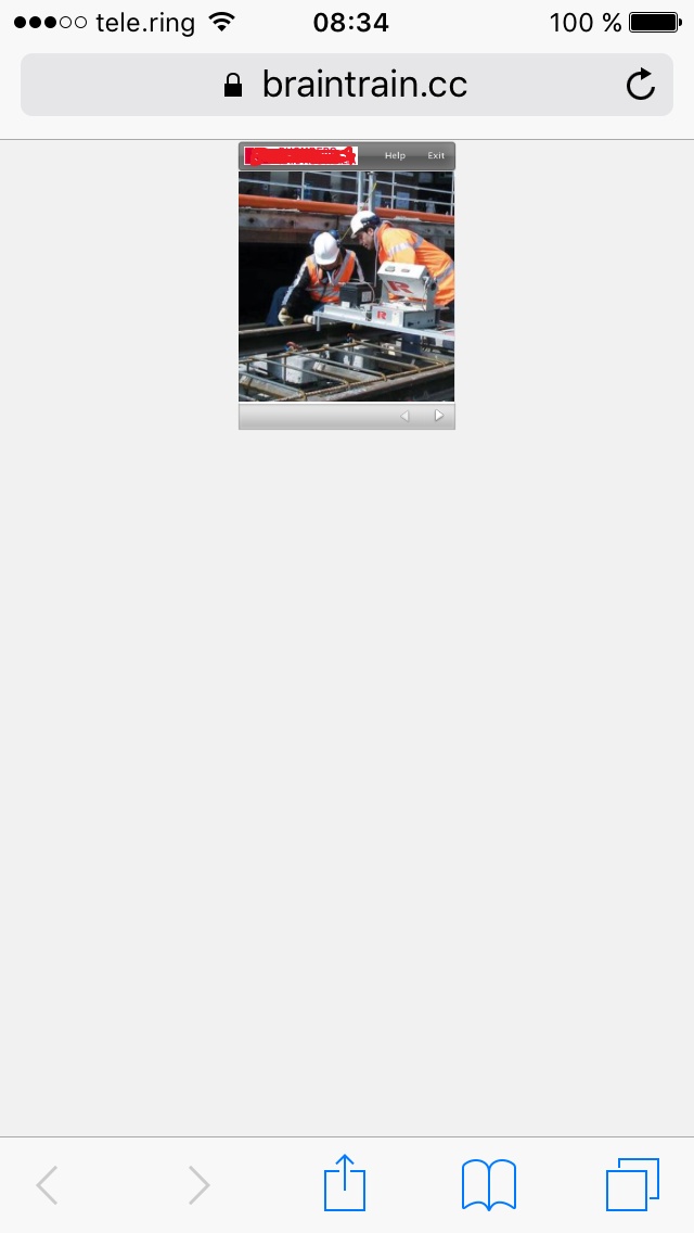
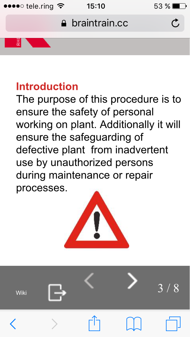
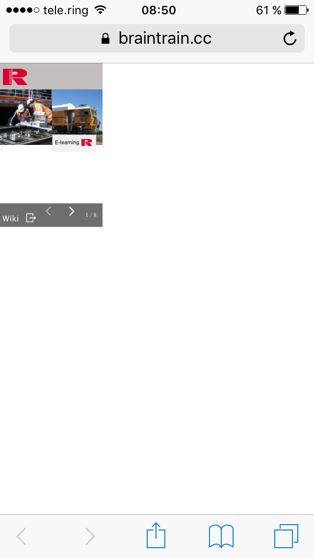
But when i start the modul on my iphone, the output size is very small...see at pic below :-) its not really responsive.
Where is the mistake? I hope someone has an idea. THX, Marcel
undefined
Discussion (15)
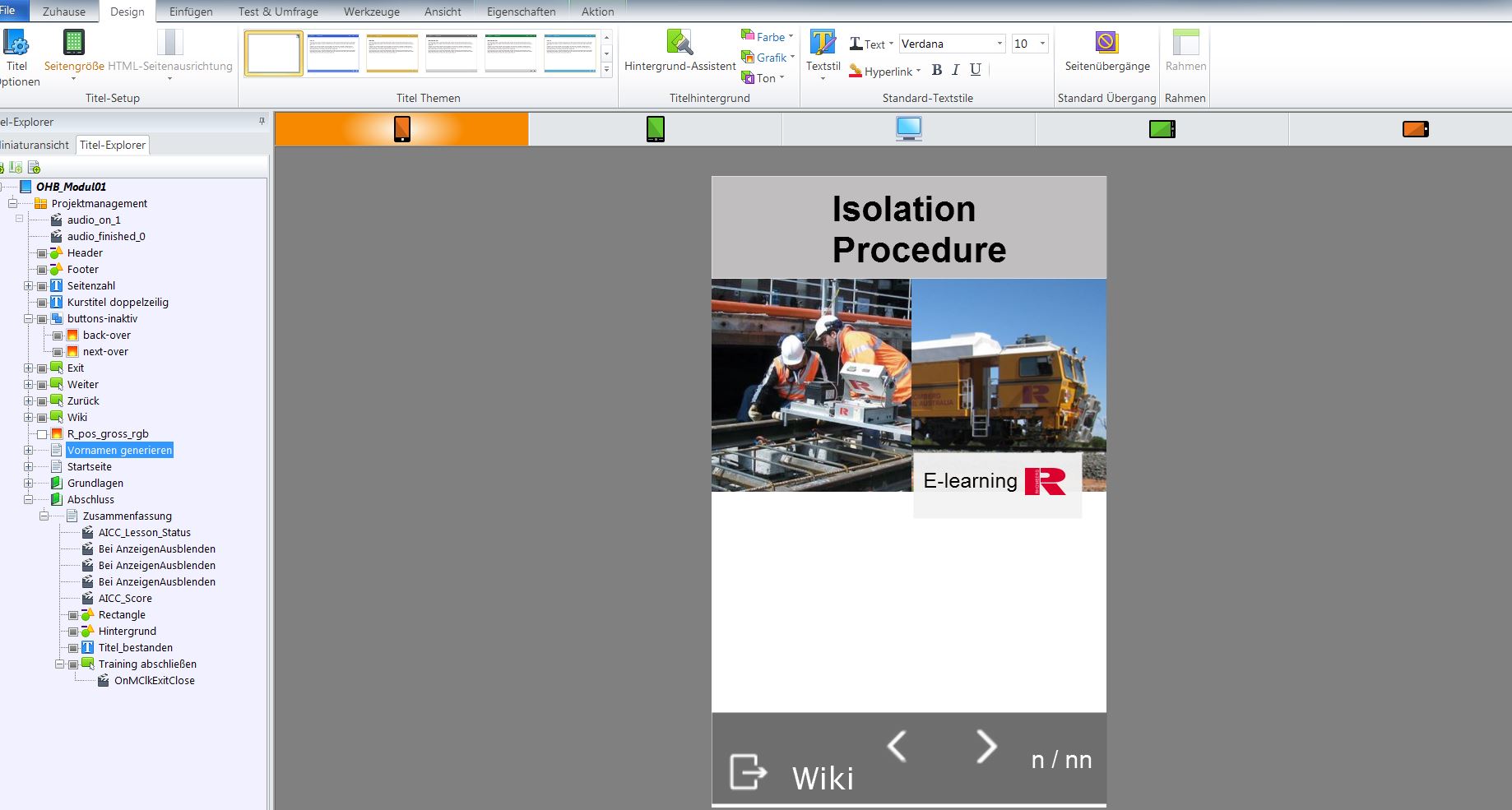
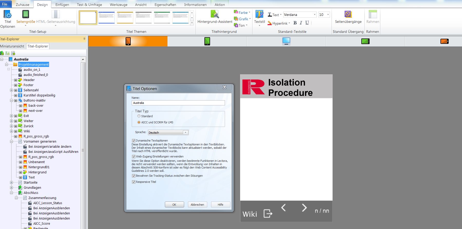
it should be a modul only for smartphones, therefore i took the small size (320 x 416). I made a standard Titel, because it should only be in one format, and not responsive...
Now i changed in the menu "Titel option" to "responsive Titel"...did you mean this?.....and created a new scorm file....
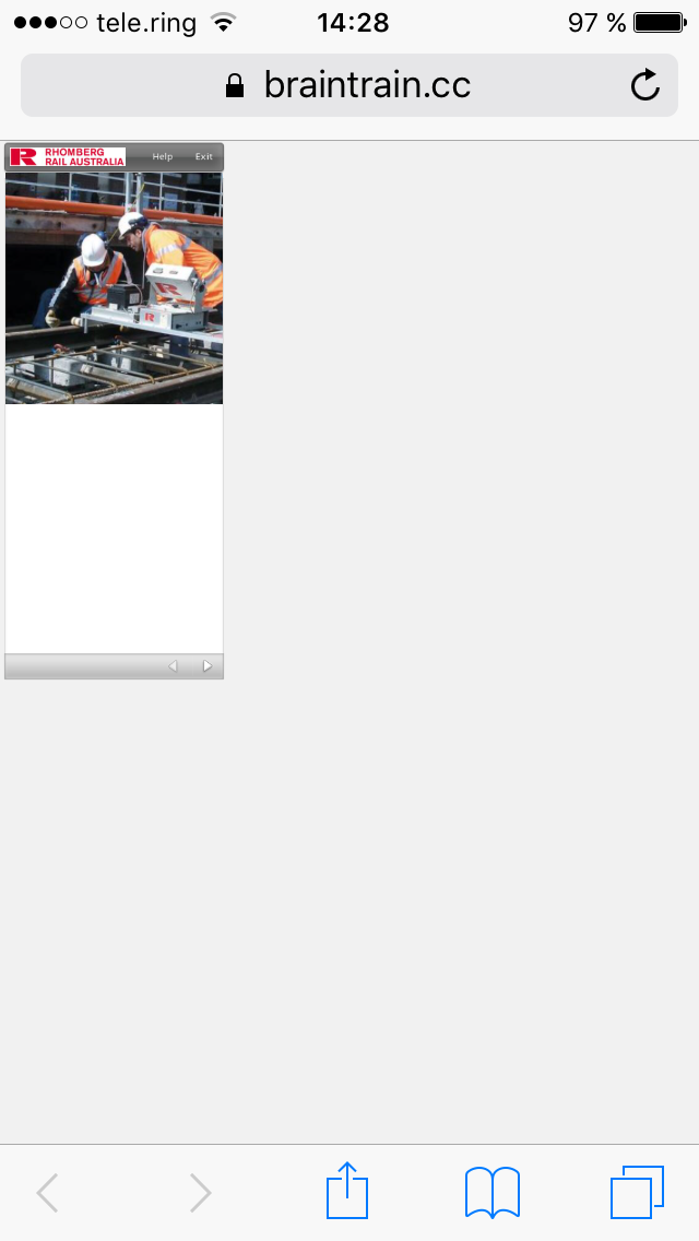
The result is nearly the same :-(
the modul doesn`t fill out the whole screen....
has anyone a nice mobile Template? :-)
undefined
Lectoras Responsive Course Design isn't really designed to build Phone-only courses. It's made to build modules for all views, i.e. it's built for Desktop view and the page layout is adjusted for Tablet and Phone.
If you haven't enabled Responsive Course Design and just used a smaller page size it should work. It seems like the not-RCD course is still getting the "Current view" and scales the page down if on Phone view.
You should use Responsive Course Design as it allows you to rearrange the elements depending on whether it's Landscape or Portrait mode.
What did you do to build it? Did you enable "Responsive Course Design"?
What are you targeting with 320 x 416 an iPhone 3? That's a bit small, isn't it? Look at your published files. I wouldn't be surprised if the Lectora output is missing the all important viewport meta tag - undefined1undefined
Why Lectora doesn't use Bootstrap baffles me.
hey Tim, thx for your answer....now i made a new responsive Title, but the same result....dont know what i make false...in the preview mode in lectora it looks really good.
greetings marcel
Hey Tim, i published the course to html and it looks better, but i prefer scorm because the variables and metadates.
Hey guys, ....so strange.
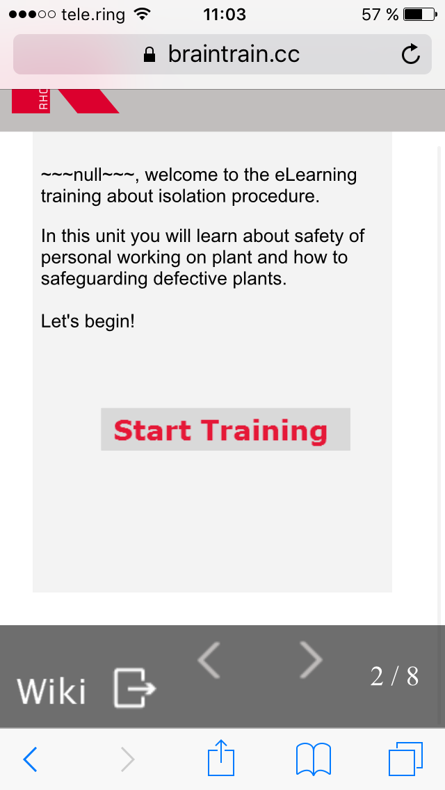
i have opened all my courses, which i have produced in inspire in lectora Online....and surprise...it works...the responsive view works nearly perfect on my phone.
What could be the reason therefore?
It would be very cool, if i can hide the safari navigation controls, so that the user can see the full course view on his device. This would be the perfect solution.
Scorm should be tested on a LMS, ScormCloud or ReviewLink. When testing that ensure any scripts you are running indeed target the proper frame ( iframe or whatever ). Some LMS's do behave differently then others. I had to add quite specific javascript to ensure a course was working 100% scaled on Ilias, often settings in the LMS have big influence on things like this.
What does the course look like, if you publish to html? Or in Preview? Did you manually set a page size? What does the "Desktop" view look like? Can you share the file? Can you share a file that shows the same behaviour but doesn't contain confidential material?
I can't find a bug in your title. When I open your file, I get a warning about the file being saved with "different Windows system DPI settings". It should be 100%, browser zoom should be 100% as well.
hi,
today i made a new responsive course but i have the same problem again. I opened it in Ilias with my iphone and the view size is very small. The course doesn't fill out my Display-view.
I use Ilias (LMS)
I built the course in Lectora 17.0.4 (Scorm 1.2)
Everytime i create a title, i have the same problems.
Is there somthing that i forget.
greetings Marcel
Discussions have been disabled for this post