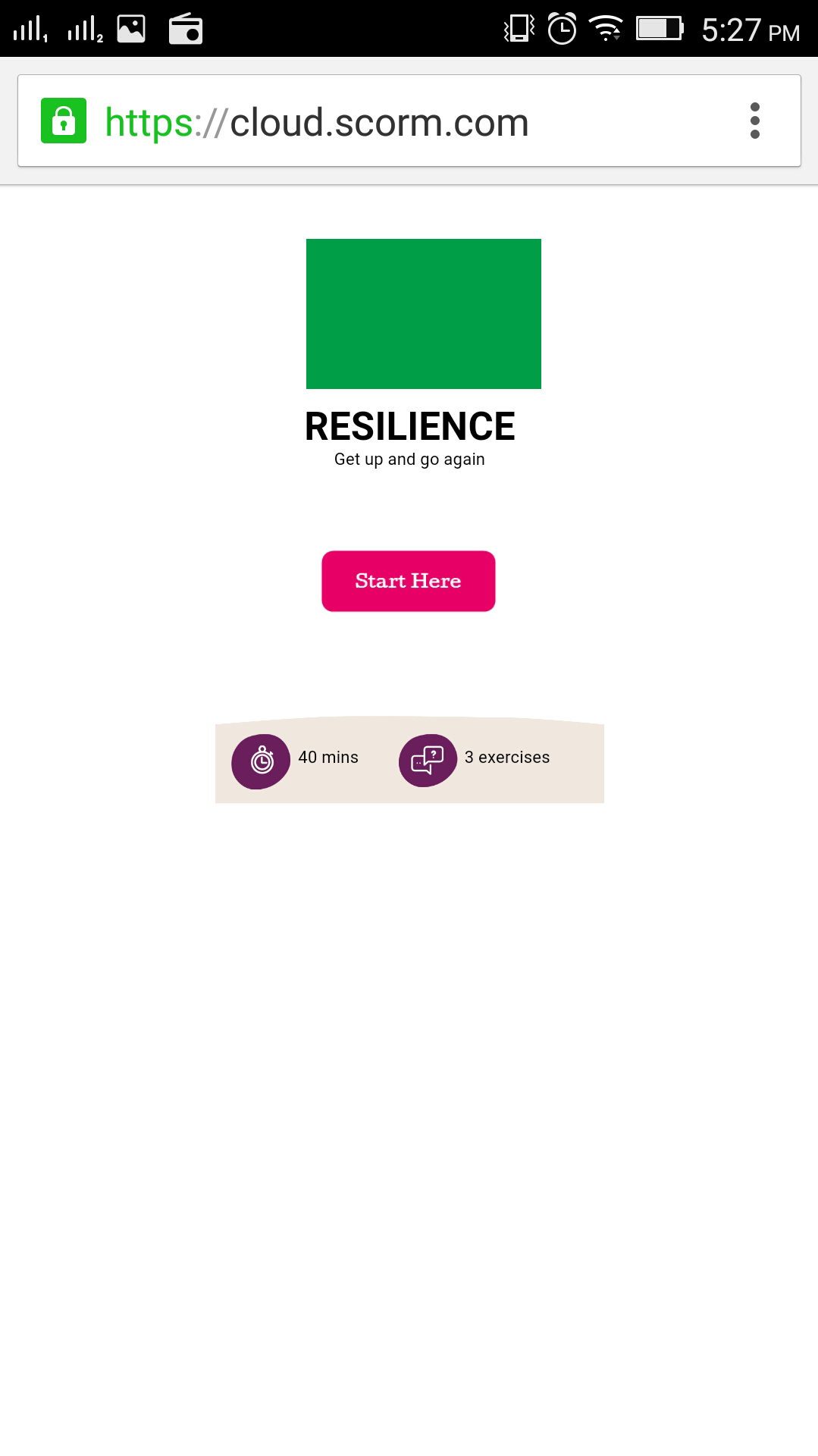
Mobile view is not working perfectly
February 23, 2016 12:00 AM
In Mobile view in responsive design doesn't work properly. It doesn't open in full-screen default. when I double tap on screen It comes in full screen but after that swipe functionality doesn't work. it needs to go on to the end of left/right side of the page completely, where lot of white spaces out of the mobile screen.
How can I fix this? and why is this happening?
Is this the lectora issue? or I am missing something?
Please advise.
Thanks.
Discussion (6)
Have you downloaded the latest update? Are you using Apple, Android or another type of device. I had some issues with responsive courses on iPhones not displaying properly, but they fixed the issues I had with the latest update.
Currently I am using Android phone.
My Lectora version is - v 16.0 (10296)
Using Chrome? It wasn't until v16.0.2 that it worked properly for me on Safari. I never had issues with Android and Chrome though.
Hi - i'm having this exact same issue just now when viewing on both chrome and safari on an iPhone 6. It looks ridiculous. is this a known issue / is there a way to fix?
This is the first title i've attempted using the responsive titles and not at all impressed with it. way more manual tweaking required to each view than i would have hoped for.
using Lectora Inspire 16.1
I am still having the same issue. Don't know how to fix?
May be someone here has got the idea to resolve this issue.
Discussions have been disabled for this post

