Android mobile and tablet, page not loading completely
June 21, 2018 12:00 AM
Hi,
Im wondering if anyone else has this issue now. All my responsive courses, built over the last 6 months, now have a funky problem on Android phone and tablet, portrait view. The problem being some screens do not always load completely or properly, in the Chrome browser.
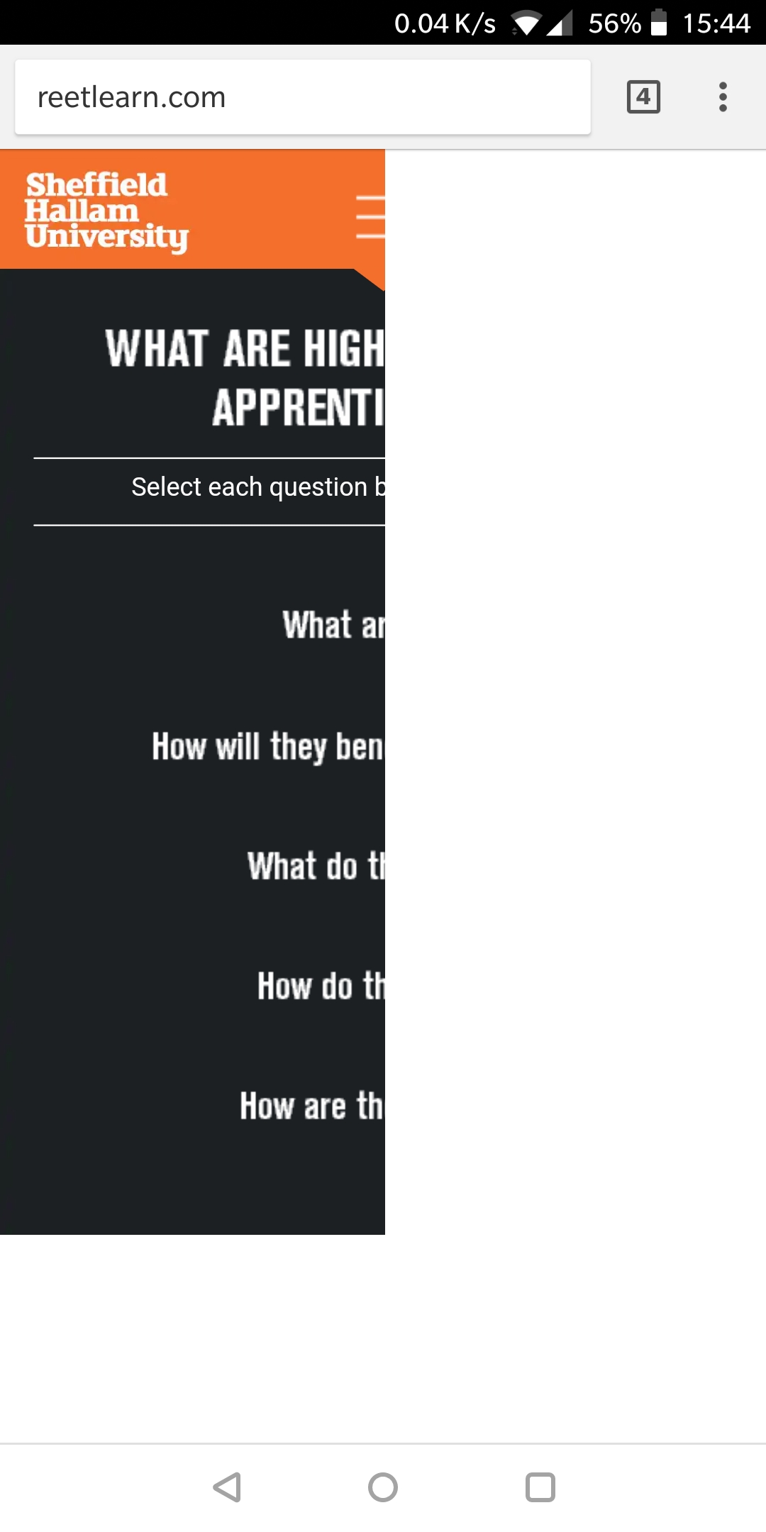
The affected pages (and I dont know why only some of them) just show the top left of the screen - images attached to this post. This can be fixed by turning the mobile/tablet to landscape and then back to portrait. Obviously not good. This is only a recent issue - courses I have built over the last 6 months have worked fine until the last week or so. I use Lectora 17.0.6 and have done for some ages now, published to Seamless Play.
Please note, I dont want to update from 17.0.6 as it when I did previously, to 17.1.1, it showed an odd grey screen to launch the course which I presume is still there https://community.trivantis.com/forums/topic/17-1-1-seamless-play-bug/#post-382030 .
If anyone uses an Android mobile or tablet, you can view a site I have built here (that has the same issue as my eLearning courses): www.reetlearn.com - do you get the same issue as me?
I pray someone has an easy fix or solution for me... :)
Ta,
Mark.


Discussion (6)
I have an Android phone, and I see the same problem you describe when I go to reetlearn.com in Chrome; the same solution (rotating the phone and rotating it back) works for me too. Sadly, confirming the problem is the most help I can be.
Cheers Stan.
Trying to look for a common theme to the affected pages, it looks like any page larger than my mobile screen loads fine and complete. It's the shorter-than-my-screen size, that look like they have the issue. Possibly.
If this helps anyone...
It seems Seamless Play is the issue - I tried all sorts within Lectora to make it work but to no avail. Whatever update has gone on with Chrome, it has messed it up (for me anyway). I have switched this off and all is good (ish)... Just got the white flash, moving between pages which I can put up with www.reetlearn.com
Just 40 odd plus to go back on now and remove Seamless Play... Eek.
This is off topic somewhat, but I've been unable to find an answer or better information on the forum anywhere.
What are your "best practices" if you are doing custom responsive eLearning modules and how are you managing the testing on all of the mobile devices and browsers. Are you emulating via the browser or are you physically using the actual hardware? Are you auto resizing images, or are you replacing images with ones that are optimized for the smaller device and orientation when moving from the tablet to the phone views?
Thanks in advance!
Hi Maura,
Depends on the project. Testing for all devices is impossible. That i state when i get a project. Next i describe what devices i have for real ( iPad, desktop PC, desktop Mac, iPhone and Android ) and on which i can test and will. Browser emulation i still have to find a proper one. Just tried BrowserStack, but that failed with iPhone on a LMS, not showing the proper view compared. If i handle a project, i resize all images. They will be the right fit for the size viewing. I do notice in projects i work on other designers and developers ignore that a lot. Images being far too big, thus needing more time to load then necessary. Check my shared content for image compression, great tool there. Using a smaller or cropped image for mobile views can indeed by a great option. Again depends on the project at hand.
Kind regards,
Math
Discussions have been disabled for this post