Text size/location different in editor than when published
November 11, 2015 12:00 AM
Hi, I'm using Publisher 12 and I'm having an issue with the text boxes in my project. Some of the text appears differently on the edit screen than it does when I publish or preview the file. Sometimes the tail end of the text is cut off on the edit screen, but appears fine in the preview/published file. Sometimes the text is just positioned slightly differently. It's almost like the text size is larger in the edit view. However, sometimes it all looks the same in the edit view and the published file. This makes it difficult to know how things will appear. Has anyone else had this issue? Is there a way to fix it?
Discussion (26)
Hi, welcome to the forums!
First of all, check for two things:
1. Is your browser zoom factor set to 100%?
2. Is your computer DPI set to 100%? (http://www.sevenforums.com/tutorials/443-dpi-display-size-settings-change.html)
Then, what browser are you viewing it in? Old browsers might render the content differently.
Finally, you might find it more productive to just resize the text boxes to give text a bit more space to fit rather then trying to figure out the browser quirks. At least this is what I usually do :)
Yes, both are set to 100%. I'm using Chrome to view, but it's the editor that's the strange part. I don't see why the text would appear larger (not smaller) in the editor than in the published or preview screens.
This is a training created by someone else that I've inherited, so I'm trying to avoid making needless corrections.
I had issues with a new computer on Windows 10, and messing with the display settings helped that. However, now I'm back on my Windows 7 machine (Publisher wasn't working that well on 10). Thanks for the suggestions and links. If you have any other advice I'd love to have it. I attached screenshots for you.
That's a definite possibility. I hadn't thought of that. I can't share the title - it's proprietary material and I have a nondisclosure agreement. Thanks for trying to help, though!
Hi Elizabeth,
You said that you inherited the title, so I'm wondering if perhaps some of the text boxes are set to use a font that is not installed on your system, so it's doing its best to substitute and looks different when published? Just guessing here. If that's not the issue, would you be willing to share the title? I'm running Windows 7 too and would be happy to take a look at it.
Related to this, I just added a new text box on top of a screenshot to cover over some incorrect text. The new text box appears in the correct place in edit mode, but again is out of place in preview mode. Any ideas on a possible solution? TIA!
I have had this same issue ever since I started using Lectora... especially when you set Header tags
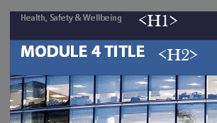
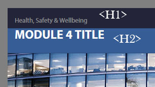
... A title I'm working on at the moment is giving me the same issue. Screenshots attached... editor.jpg is from Lectora, browserIE.jpg is from Internet Exporer 11 and browserChrome is from Google Chrome. There is a big difference between the H1 tags from editor to browser. Not so big a difference with the H2... between the two browsers there is only a shift to the left a couple of pixels from IE to Chrome.
undefined

Hello, I have the same problem with Lectora Publisher 16.1.1 (10553).
I have attached a screenshot of the "Edit mode" where everything looks great.
The other screenshot shows the "Run Mode" where the text is misaligned. The published EXE file looks the same.
The title itself is also attached.
These screenshots are made from a new title created by Lectora 16. I have only inserted a PNG graphics and the text.
We have seen this difference on 2 PC's. The published EXE file was tested on several PC's with different operating systems (Windows 7 and Windows 10) - the problem was always the same.


Just retested it with plain unformatted textfields, no CSS or JS targetting those textfields. In my previous tests CSS and JS involved.... textfields changed by JS. So i guess that combo somehow is causing the crossbrowser differences.
Continuing tests...
Spoony, if you want to go with that size and use a image for the background you should probably just add the text to the image.
Actually related to this issue i run into a similar one recently. Text really changing position in different browsers.
In IE the position is as should be...in Chrome its at least 50 px lower. Gonna do some more tests to pinpoint the exact problem.
Tested it both in Publisher and Inspire.. v 16.02 and v 16.1.1 and in Chrome and Firefox text previews on a different vertical position then in IE. Will test some more...
Hi, I also have the same problem with Lectora 16.2.2. The text is not in the same place in edit, run and preview mode. It is kind of annoying since I have to figure out how to position the text so it's on the "right" place in preview mode.
I've tried the eLearning Brothers template and it happens there as well...
undefined
Hi Jennifer, I already did:
http://community.trivantis.com/forums/topic/text-sizelocation-different-in-editor-than-when-published/#post-318507
To reproduce the problem, you just have to open Lectora with a new, blank title, insert an image file and a text block and switch to the "Run mode". Then you will see that the text is positioned too low.
Is anyone able to provide a title that I can share with the development team for testing?
According to the .awt file, it was V16.1.1.
I guess, that was the most current version at June 14, 2016.
I've run into this issue a number of times with the various versions of Lectora. I've found that setting the text box properties to convert to image has helped quite a bit with text position issues and bulleted lists. Hope this helps.
Spoony, see http://community.trivantis.com/forums/topic/lectora-17-is-now-available/page/2/.
I find that it works best if you put each paragraph of text into its own text box.
Ben, what version Inspire are you using and can you post an actual page from the lesson, the pictures do not allow us to see why it's previewing like that. Also, did you try to see what it looks like published?
Has anyone seen a correction for this. If I convert text to image it does help but I'm creating 508 compliant content and that option is not available to me since it won't allow screen readers to read what was originally in the text box. Im using 17.0.4
I added some images test1 is in the publisher, test 2 is in run mode, test 2 is the html preview (firefox)
So, anyone got a fix on this issue yet? (Running Lectora 17)
Does anyone know whether the issue is fixed in Lectora 18?
Alright this is great that everyone is having the same issues. Could SOMEONE from TRIVANTIS pipe in with the solution.
Rationale why this is happening is because every users personal browser is using it's own default settings to view the material on the page. Which is hilarious because i'm using verdana, arial and the most used fonts in the universe and somehow the browsers are still screwing up the kerning and line spacing.
Solution: (the only one I know of that is painful as faaaa) is to click on the properties of the text box and click on convert to image. All this will do is preserve all the aesthetic settings so each persons browser doesn't and it will hold the integrity. SEE ATTACHED.
Only other solution is to reduce the volume on the page of content.
But serious trivantis should have their publishing and developing team FIGURE THIS OUT. In this day and age we shouldn't have to be worrying about this problem that is so 2000's.
Cheers,
Doug

Discussions have been disabled for this post