Responsive Title Not Fitting in LMS Frame
January 26, 2017 12:00 AM
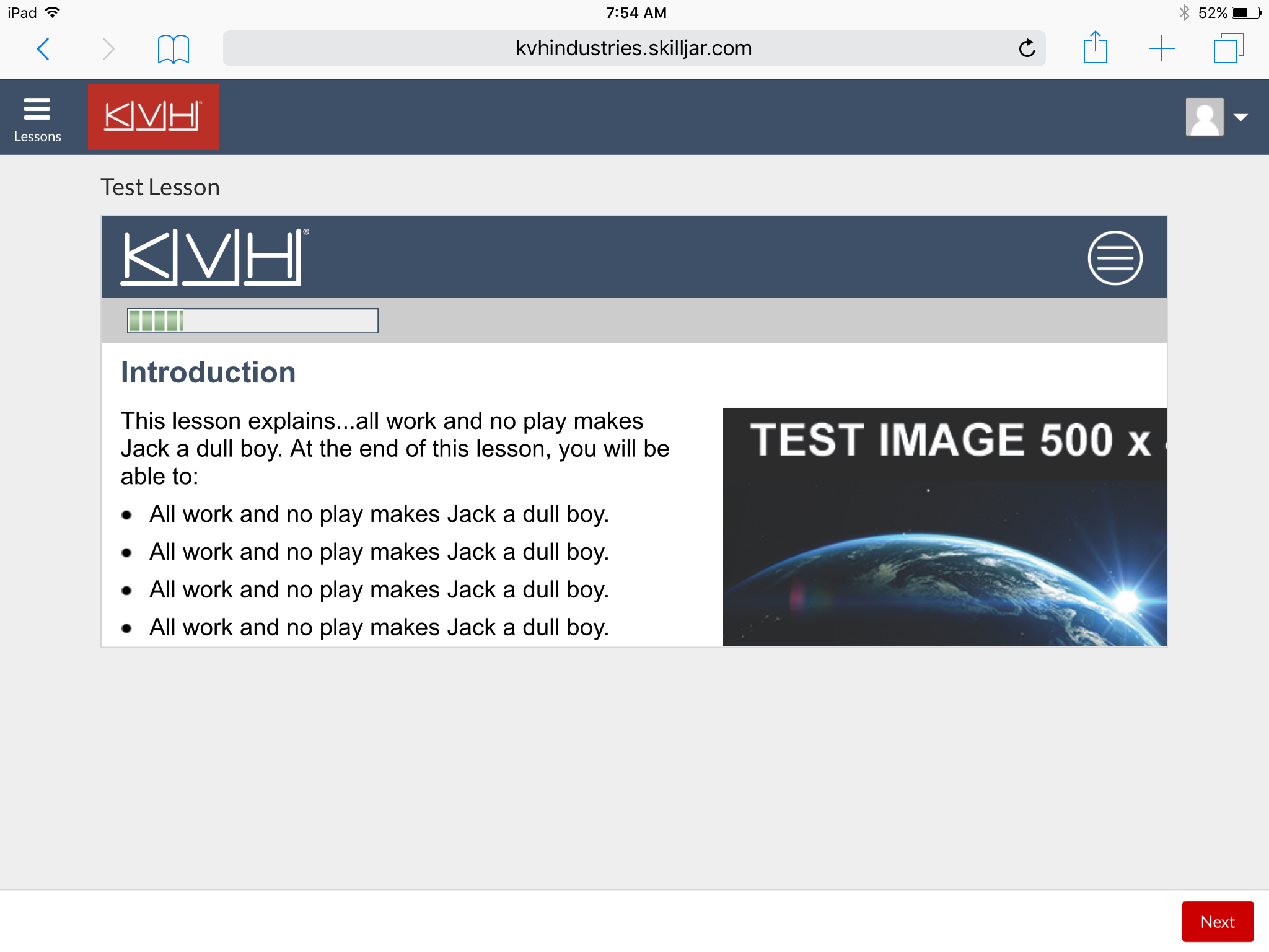
My LMS (Skilljar) is responsive, so I wanted to upload responsive Lectora courses. My first test course fits well on all devices in all orientations when running as HTML (not within the LMS). But the LMS presents all content within a frame. The course does not fit to the width of this frame. I think it's detecting the width of the browser window and sizing to that width instead of the frame width. Is there any way to make a responsive course fit within the frame?

Discussion (3)
I'm also now seeing that the title doesn't fit the width of various Android devices (within a browser window, not the LMS). The title gets cut off along the right edge.
Hi Mike,
I don't know the answer to this, but the first things I'd try is to publish to Scorm 1.2 (if it isn't already) as 2004 will likely have a different frameset to 1.2. If that isn't the issue, I'd look to see that any compatibility settings on the LMS is IE9 and above. I had an issue where the default was IE7. Changing that to IE9 fixed my responsive course looking odd, similar to yours, on Cornerstone. Another similar example was to change a setting on the LMS to "use the course player settings" not "the LMS settings" - something like that.
Hope that helps.
Thanks,
Mark.
Thanks, Mark. I will ask my LMS provider about these settings.
Discussions have been disabled for this post
