Page width in responsive course title
September 4, 2016 12:00 AM
I can't change the width of the page in a responsive course title, almost for all devices except desktop device.
Discussion (6)
Lectora's logic: the width of the page in the mobile views is irrelevant because it will always be sized to match the actual device width. However, I do understand the frustration and I see no reason for the width to not be user-controlled. Why can't I set a page to e.g. 320px width and then let Lectora resize it to device width?
Example: I would like to set the page width in mobile portrait to 640px, design my course in Photoshop at 640px width, export all assets, build the course and then when it resizes to 320px on an iPhone, all assets will be 2x-sized for retina.
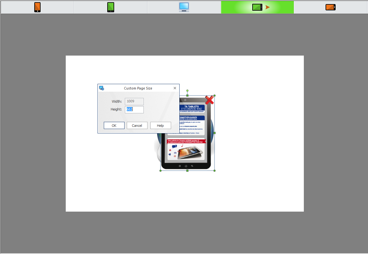
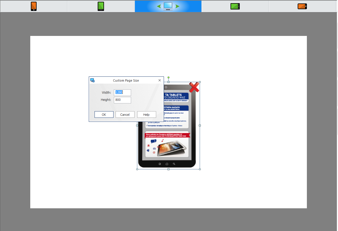
Another example: I need to build a course that matches an iPad screen exactly in full screen mode. So it needs to be 1024 x 768 px in tablet landscape. Lectora offers me 1009px. So to achieve what I want, I need to calculate 1009/1024*768=757 and set the page height to 757. Then, when 1009 expands to 1024, 757 will expand to 768. Why do you make me do this?
More examples: I need to design two pictures for a page. One images needs to be 1024px wide, another one needs to be 600px. So I design them in Photoshop, import into Lectora and they are a bit wider than necessary, of course. So I have to resize 1024px it down to 1009px and 600px down to... wait.. what was the number? Let me get my calculator.. It should be 1009/1024*600 = 591px (approximately!), okay, size it down to 591px. Imagine doing it to every asset in the course.
Of course, I could design the whole course in Photoshop aiming at 1009px but that would be mighty inconvenient because I will have to recalculate all standard iPad values such as 40px header bar (I will have to keep in mind it is only 39.4px high in my 1009px world) etc. And while assembly in Lectora would be faster, all the images on the iPad would be stretched a couple percent, resulting in artefacts.
What is the efficient way of doing this? Lectora's efficient way of doing this would be to create assets in Photoshop as 1024x768 (easy), then build the DESKTOP page in 1024x768 (easy) and then let Lectora resize it down to 1009px in tablet view automatically (also easy). Problem solved? Not quite. It only works if the desktop view is exactly the same as tablet view. For every element that isn't in the desktop view, the chaos from my examples above ensues.
Long story short: remove the "magic numbers" from Lectora, let us redefine 1009 and 785 and 480 to whatever we need.
Thank you for your time and advice. I will keep the numbers 1009 and 785 and 480.
Even better would be to change the way it works entirely and go with standard media queries and external css sheets like everything else on the web.
@ssneg - I shared your examples with the product team which will prompt them to look at the logic.
Allthough i do like Lectora's responsiveness i have to agree with Sergey's comment. Actually a question clients ask more and more lately is, the 'limited' size/scale of the desktop variant. Let me explain.
When designing a responsive course at a given size the mobile and tablet versions will fit nicely fullscreen. However depending on the size of your monitor, the desktop view is limited to a fixed, given size. So you have a limited blocked in view on your desktop. Offcourse you can tackle that by adding a htmlbackground, but that is still quite limited.
Clients i got now want the desktop being used completely too. Adaptive courses. As it is now Lectora doesnot offer that option. For that i have to use Elucidat, Rise, Adapt or Moodle with H5P. These tools offer that. I do not think you can compare these tools with Lectora, but i do think responsive/adaptive coursedesign might evolve into this direction.
Discussions have been disabled for this post