Developing for iPhone X
May 23, 2018 12:00 AM
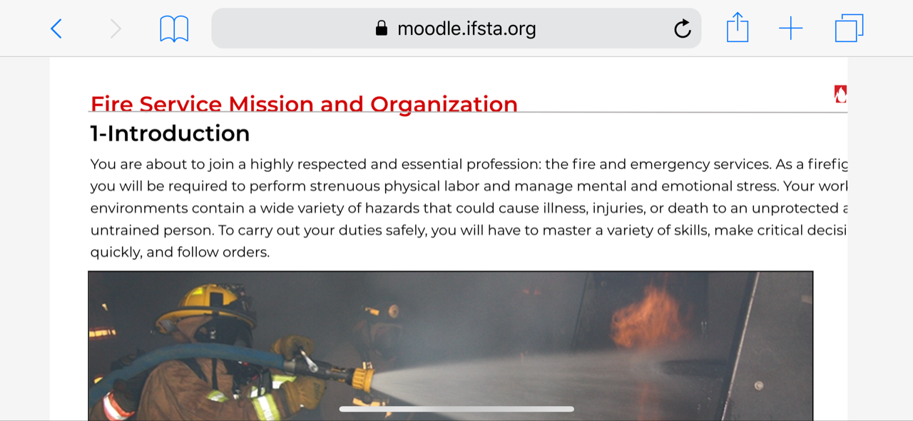
I created a responsive title that works okay on my iPhone 8, but not on the iPhone X. The Apple site says that Safari will display my page "beautifully," but that hasn't been the case. Instead, everything on the right-hand side of the screen (in landscape mode) is cut off. Does anyone have any idea what I'm doing wrong? Are we missing a setting in Safari that would fix this? I've attached a screen shot of what it looks like.
Thanks!

Discussion (5)
We tested this out on an iPhone 8 and iPhone X and we do see this issue on iPhone X specifically. Please confirm that you can scroll the content horizontally to get to the content.
You are not doing anything wrong. This behavior is not correct it should scale for the width of the device, and not require you to scroll horizontally. We are writing up an issue and will fix this ASAP.
undefined
Yes. We can get to the rest of the content if we scroll (it's really more like dragging), but obviously that's not an optimum situation. Thanks!
Any news on this issue? Cause we have trouble getting LO to publish to iPhone ( iOS11 ) too. Not scaling properly.
Any updates on this problem? Thanks for any help you can give me. - Janice
Any news on this? We have this problem now..We use online, maybe its fixed on the desktop version?
Discussions have been disabled for this post
