Design Elements Appear Differently in Lectora than ReviewLink (and CSOD Pilot)
October 1, 2020 12:00 AM
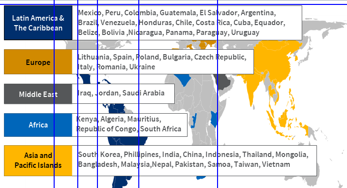
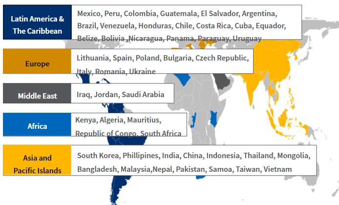
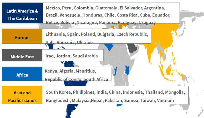
Hi first time poster, long time lurker. When I design something in Lectora, a lot of the time it comes out looking very differently on ReviewLink as well as CornerStone Pilot. It mainly has to do with object sizing and text extending beyond its boundaries. I have attached screenshots of one example below.
We are using a template provided by a third party vendor and they have inserted some CSS and JavaScript but I have not been told what, exactly, they are doing. However, I did experience the same thing in a previous version that did not have the additional CSS and JavaScript. I'm using Lectora 19 on a nearly new 16 gig SurfaceBook 3. I do not recall having this problem using Lectora online on my almost 3 year old iMac. I am forced to use the PC for work reasons.
I have found myself designing and then testing and then misdesigning to compensate, which is a giant pain. Does anyone have an idea what might be happening and how I can make sure that what I see in Lectora is what appears in an exported project? Any suggestions are highly appreciated. Thank in advance.


Discussion (2)
Hi,
There's obviously a difference in line-height between Lectora and the browser. Is there a relevant setting in that external CSS? What did you do to vertically center the text?
Hi, thank you for responding! I think the CSS is controlling the line spacing. But I've had spacing of the text set the same as what the CSS defines and still find some similar misalignments, although it seems better. I can say that it does appear in "Preview in Browser" mode, which uses Edge, as well as in ReviewLink and CSOD Pilot, which is Chrome. I'll try to square everything up and make sure it's the same and see what happens. Thanks!
Discussions have been disabled for this post
